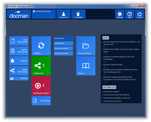
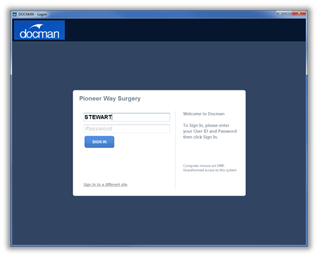
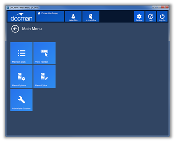
New Login Screen design leads you nicely into the new main menu.
The login screen has a more modern look and is easier to read on the screen.
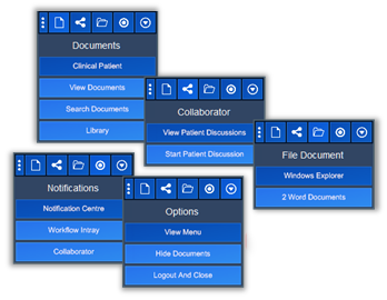
New icon designs present a more intuitive route to features.
The new icons, presented on tiles, deliver a better use of space on the menu screen. Text is clearer and easier to read.
Grouping of features into sub menu screens allows users to focus on the functions they need to access.
We have now grouped features in Docman into Sub Menus to make better use of screen space in the Docman Main Menu. By grouping tiles into sub menus, we have reduced the number of functions that need to display on the main menu, making better use of screen space and making the screens easier to read. But don’t worry about extra key clicks as any frequently use items can be added to your personal main menu.
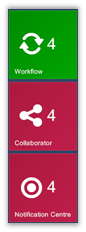
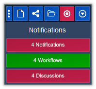
Live Tiles automatically update.
|
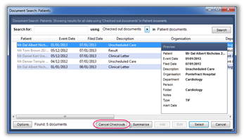
The notification Centre provides a place where all notifications are in one place. You can use this to go through all your unread items or you can go directly to Collaborator or Workflow to view your unread discussion notes and workflows. The live tiles display the number of unread items and turn green where items are normal priority or red where you have high priority items. |
|
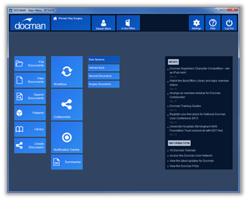
New Menu layout makes much better use of the available Space.
The menu has a completely different look with a better layout and tiles that are easier to read.
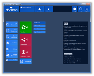
Organisation and system information displays at the top of the screen.
The menu has a completely different look with a better layout and tiles that are easier to read.
On the left, you have the Organisation Name and the Name of the person currently logged in. You also have the Out of Office button so you can easily switch your status. You can click on these tiles to view further information if you wish.

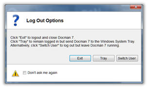
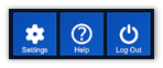
On the right, you have access to the settings and help menus. You also have a Log Out tile which now offers you the option to Log Out or Switch User.
The colours of the Organisation and In/Out Office tile will change if there is any change in status.

When you have read all your unread items, the live tiles will update to display in blue.
New toolbar design is clearer and easier to read.
The new design toolbar fully complements the main menu screen. The new look tiles are incorporated into the toolbar with drop down menus that are a lot easier read on the screen.
Live tiles repeat on the toolbar notification menu. Like the main menu these tiles change colour to red (indicating there are high priority unread items) or green (indicating unread items), the number displaying on the tile denotes the number of unread items regardless of their priority. This we believe will be useful to users working in the clinical system.
Like the live tiles in the main menu, the toolbar live tiles will change to blue once you have read all the unread items.
Access to system features such as Maintain Lists have all been included in the menu group named settings.
The new Settings Menu will give you quick and easy access to features such as Maintain Lists, Menu Options and Administer System.
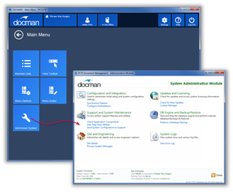
There is an easy to use back button to return to the main menu.
Faster transition from Docman to Docman Administration.
When accessing the administration module from the new settings menu, the user authenticates automatically so there is no need to log in again.
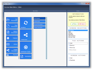
The New Menu Editor allows you to customize your menu to meet your needs.
The new Menu Editor allows users to create their own personalised menu screens.
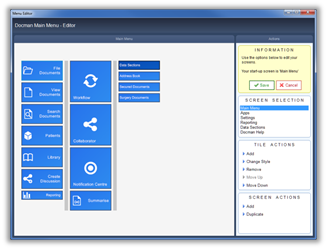
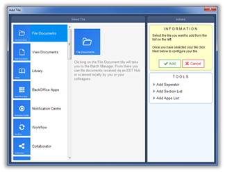
They can click the Add action followed by the Add Separator action to add a new column to the menu.
They will then see the result…
Easy click and drag action to reposition tiles in the menu editor makes this an extremely useful tool.
It is easy for users to move tiles. Users just click and drag to the desired location.
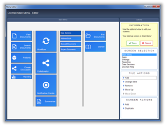
Clicking on the Change Style Action will allow users to change the size of the tile.
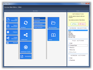
Users then click Save when finished. This will display the new menu.